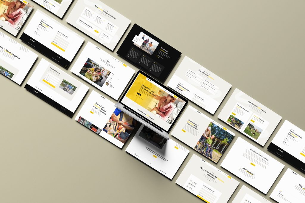
When Aana from Carismatic Inhome Care approached me, I was immediately impressed by her exceptional vision and passion for helping people. She had a compassionate service and a great mission, but her brand felt a bit lost. The website was overcrowded, and the message was getting lost in the noise.
My first move was to cut the clutter. The main selling point was their personal care, so we made that the focus.
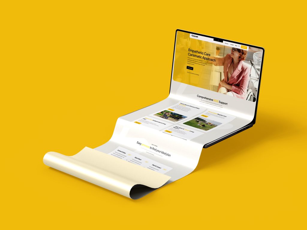
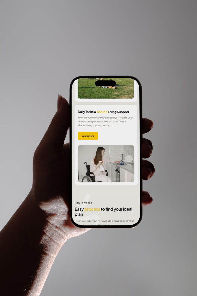
The goal was to create a simple, good-looking website that would make their exceptional services from MND Specialist Care to Supported Independent Living instantly visible and easy to understand. We intentionally kept it simple to make it stand out from the competition.
The results? We're getting great feedback, and clients love the website's clean aesthetic and colors. But more importantly, the brand now clearly conveys what it does and how it's different. It's been one of the most rewarding projects I've worked on because we built a brand that not only looks good but also helps people find the quality care they deserve.
"The first thing Soubh asked me was, 'Why the yellow?' I knew he was the right person right then and there.
Our brand was a mess of bright colors and a confusing website. We had a compassionate mission but were getting lost in all the noise. He made our personal care services the real heart of what we do the star of the show.
He didn't just redesign our website; he gave our brand a clear purpose. Now, people get who we are, right away. It's been one of the most rewarding projects, not just because of the great feedback on the new clean look, but because it's helping people find the quality care they truly deserve."